How to tackle the client/stakeholder’s funny comments:
Sona
Aug 14, 2019

I’m looking for some jazzy UX.
The design looks simple. Can we make it more beautiful?
This is good, but can you change the color?
I did this in PowerPoint. Can you make your design look like this?
Heard these before? Are you smiling? You must be a designer.
Every now and then, we designers hear one or more comments like these from the clients or the stakeholders. There were times I used to get annoyed when I heard those kinds of comments. But things got changed when the thought occurred to me that “We empathize with the users. But, why not with the stakeholders?”. They too work for the greater good of what we build. When they comment on the design, however generic or worse they may be, shouldn’t we try to find the actual reason behind it?
Here are some techniques that I used to tackle those and turn them into meaningful design inputs.
Ask why

In one of the projects, my team designed a map view to show the percentage of growth in every cluster. We used a subtle color for the map and indicated the growth with red and green bubbles of various sizes. It clearly helped the business users understand the distribution within seconds and the design looked elegant. But, one of the business heads said
The design is not good. Color-code the clusters instead of bubbles.
Only when we asked for the reason we found that the cluster demarcation is not clear enough.
Find a middle ground

In one of the workflows that we designed, we kept the fine-tuning of input variables in the first fold and onSubmit scrolled to the second fold to display the processed results. But, the client insisted on dividing the screen into two halves, keeping the fine-tuning on the left and the results on the right. But, the designers were against the idea as the number of input variables was more. It would result in having a horizontal scroll in both halves and make the UI extremely busy.
Considering the usability and the reason behind the suggestion, we then suggested a solution where the fine-tuning will happen on the first page. And onSubmit, the user will be navigated to the results page where the results and the details of the modified variables will be shown in two halves.
Ask for inspirations

Sometimes it happens that the stakeholders and the designers talk about two different things. Once a conversation was going nowhere as one of the stakeholders kept on saying the design is not up to the mark. We then asked him to provide an example to help understand the problem. Only then we found out that he was talking about micro-interactions.
Provide options

We kept the UI as simple as possible as the application that we designed had a lot of forms with a complex workflow. But, the client said,
The UI looks boring, can you make it jazzy?
Even though we made enhancements to the UI without affecting the usability, they were not happy with it. So we provided an additional option and presented them with the A/B results.
Show high-fidelity designs

During the early stage of one of the projects, we did the wireframe and shared that with the client to discuss and get feedback on the user flow. They rejected it saying
The design is not good, this is not the expected UX.
After a few back-and-forth discussions, we understood that they were talking about the UI. So, we decided to do the high-fidelity design and then shared that. Finally, they were happy and gave a go-ahead.
"What looks beautiful feels usable."
Would love to know if you have come across similar situations and how you tackled them.
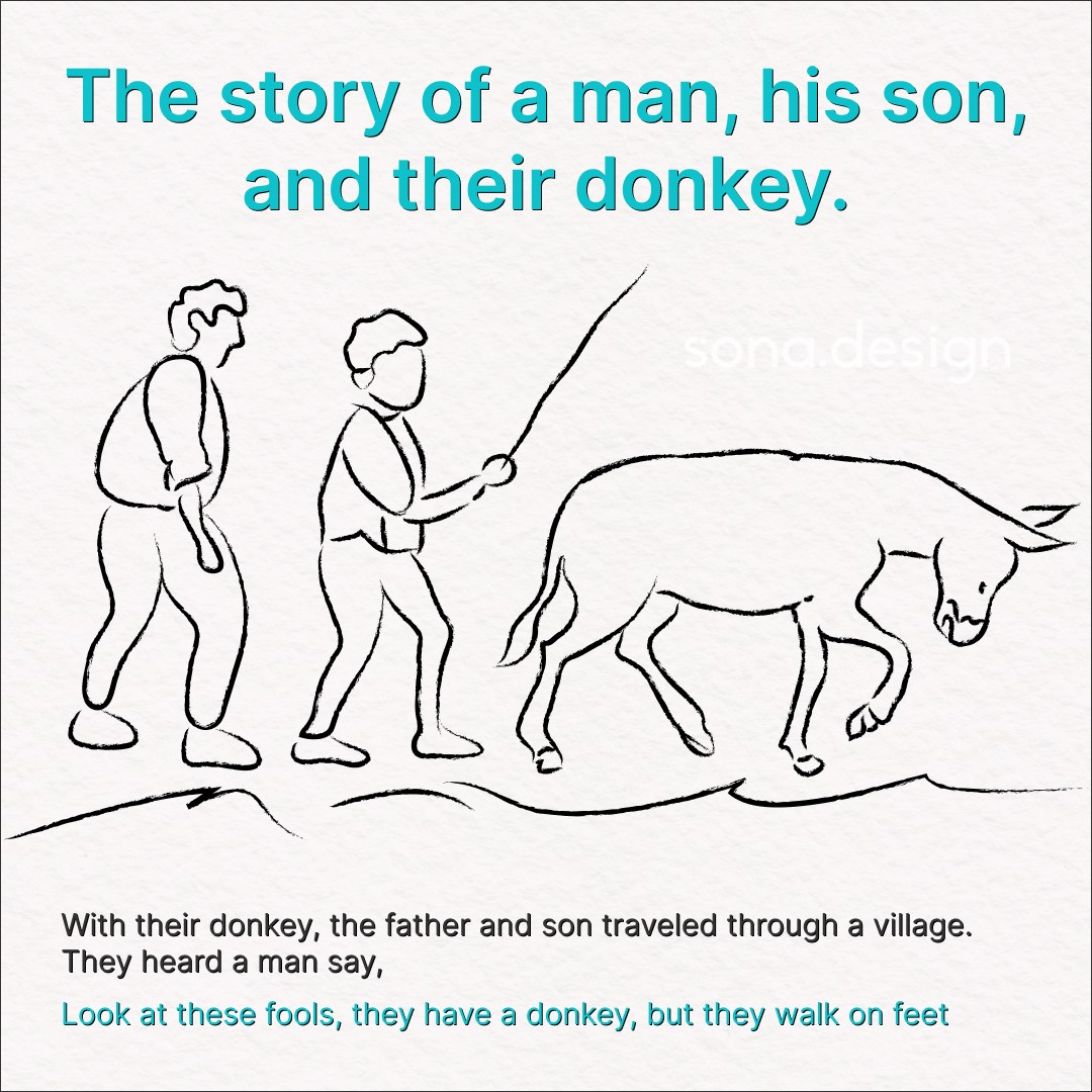
The story of a man, his son, and their donkey.
A popular fable that has been passed down through generations. I very much relate to this story.

The secret is to work less as individuals and more as a team.
Teamwork and collaboration can lead to greater success and productivity than individual efforts. "The secret is to work less as individuals and more as a team. As a coach, I play not my eleven best, but my best eleven." says Knute Rockne.

My kid’s star reward experience
This challenge was one that every parent has likely experienced, and I was no exception. Nevertheless, I was able to overcome it with this.